Follow me on ...
Search
Twitter

Entries in software (6)

11:12PM

iOS Update

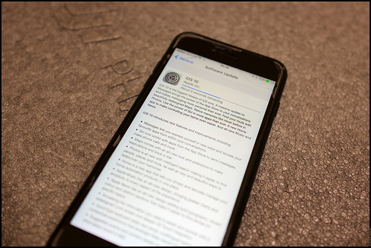
So, this would be the first of series software updates to tag along the launch if both the iPhone 7 and the Apple Watch Series 2. First the iOS 10, next would be the Watch OS 3 and next week, the new Mac OS Sierra.

The download was bigger than I expected. 1.1 Gb. Luckily it was a doddle with my bandwidth but I would imagine that it would've taken ages on my old speed.

The update process was smooth. It did render my Squarespace app useless. From now on in would have to update the blog only from the computer. No more mobile upload, at least for my main blog. Harisrahman.com was still running the legacy Squarespace version 5 engine and I liked to leave it that way. They were more predictable and stable.

My phones, I pads and watch had had their update. Time to wait for the Sierra.

Related Posts Plugin for WordPress, Blogger...

3:43PM

Mavericks!

Decided to take things easy this morning. Got my rounds and clinic sorted out early and then packed my lunch and headed out to the apartment and just chilled there. Watched a bit of TV, a good movie on Sundance actually.

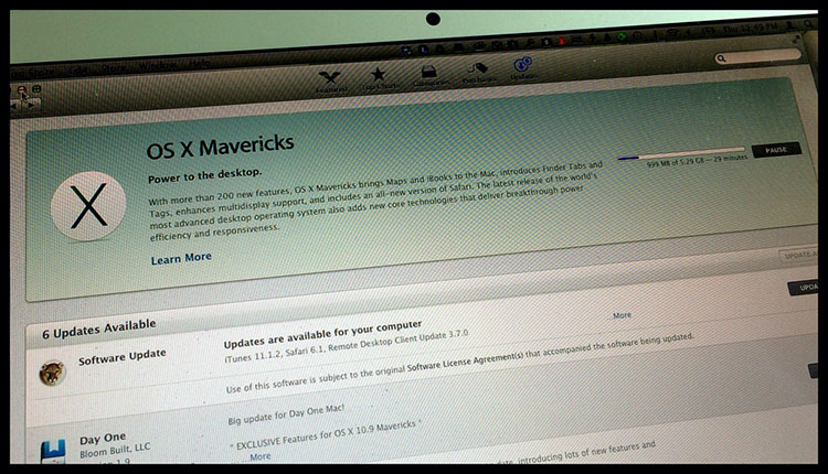
And the main thing - updated both my iPhone and then MacBook to Mavericks. Painless than I thought and I updated the rest of then iWork suite while I was at it.

Still yet to try the softwares extensively as I was just about to leave for the afternoon rounds. But a couple of thing I realised, Safari felt faster and the Map app looked cool. Not something which I would use daily.

The update also killed a number of my third party apps as well. 1Password was not on by default and I had to migrate all my password to iCloud Keychain. TextExpander was also disabled, but I was sure the updates would be coming soon. Both Aperture and Photoshop seemed to be functioning OK. I would be looking at Keynote later today when I reach home.

Related Posts Plugin for WordPress, Blogger...

11:34AM

New Flickr. Y No Pro?

I've been a Flickr member since Nov 2007, before converting into a Pro in 2009. I've never looked back ever since. I do host most of my photos on SmugMug though and I tried 500px and Picasa in the past. I've never trusted Facebook with my photos. I was keen on Google Plus but felt Flickr was still the clear winner.

So, I was glad to learn that Marissa Meyer made Flickr one of her main products when she took over Yahoo! Certainly Flickr is a good product, and the previous management neglected this diamond. So, which way did the new regime was taking Flickr?

I knew things were serious when the 3-months Pro account was given away before Xmas last year. I was waiting for them to implement a face-lift a lot earlier. So, when it finally came, I was actually very happy. Google probably caught wind of this change since they only updated their Plus experience only last. For the better.

I'm happy with the new interface. Definitely more modern. But the subscription model made me sit back. I felt that the company missed one important element here. Flickr was actually built on loyalty.

During the lean times, the user stood by the product. They wore their Pro badges with pride. I was one of them. By abolishing Pro - only allowing old timers to be grandfathered in if they have a recurring payment program - these hardcore band would wither away. I personally felt that the loyalty wasn't rewarded. In the days of social media, 6 years is a long time!

The jacked-up interface was a welcomed change. But I was hoping that there would be movement to recognise these Pro group of users who had stayed on through thick and thin. If there is one, I would sign up in a heartbeat. To have to pay extra just to have no advert is just plain lame.....

Related Posts Plugin for WordPress, Blogger...


8:12PM

The New Layout

It was the other way around. After asking around, most of my friends were not keen on the new Facebook layout. Most people felt that the new layout made their details too opened. I kinda agree with them and at the beginning decided against changing.

The listing of links were much more organisedSo were the album displayHowever, when i saw how the new layout looked on my iPhone, I soon changed my mind. It looked neat and since I tended to put up plenty of links, all the entries were put down chronologically. The new layout made everything looked more visible and clean.

The entries were arranged chronologicallyAnd navigating through them was super easyShame that the iPad version has yet to adapt the new setup. I was sure it would be long before an update arrive.

Related Posts Plugin for WordPress, Blogger...

10:19PM

5.0.1 Update

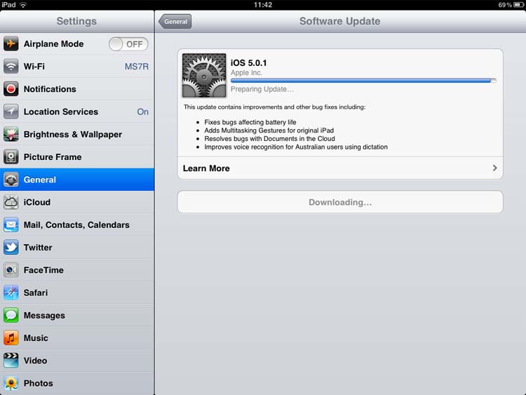
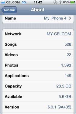
One of the major advantage of iOS 5 was not the notification. That was nice, but we could see that one coming a mile away. I felt the major improvement was the updates. Previously, eve a small update meant downloading the software via iTunes which would take ages as the file would typically be around 700MB. That would jam the bandwidth for around 3 or so hours on my connection. Then, there was always the risk of the connection being interrupted halfway. Nightmare.

With iOS 5, the update would be direct. Instead of 700 MB, the latest update was less than 10% of that. I did that through the fast connection at the office. After the program was downloaded, a gentle message popped up to tell us that the device would be restarted. In under 5 minutes, I was done. For both the iPhone and the iPad. Great stuff.

Has the update made any difference? I think it did. I noticed that the battery drainage was slower. I would still have more than 50% juice on my way out of the office. And this was after heavy use with push email and everything. The night before the update was announced, I suffered the first episode of battery drainage. Inexplicably, my phone just ran out of power in the middle of the night. It was around 60% before I went to sleep. I woke up at 5 for the loo, and the phone was already dead. Luckily there were no call from the hospital that night ......

Related Posts Plugin for WordPress, Blogger...